• Just For A While

Whistle While You Work | Design + Art Direction by Graham Sykes

Whistle While You Work
  • Just For A While
jcf_1.jpg
jcf_2.jpg
jcf_3.jpg
jcf_4.jpg

Jerwood Charitable Foundation

July 28, 2013 by Graham Sykes

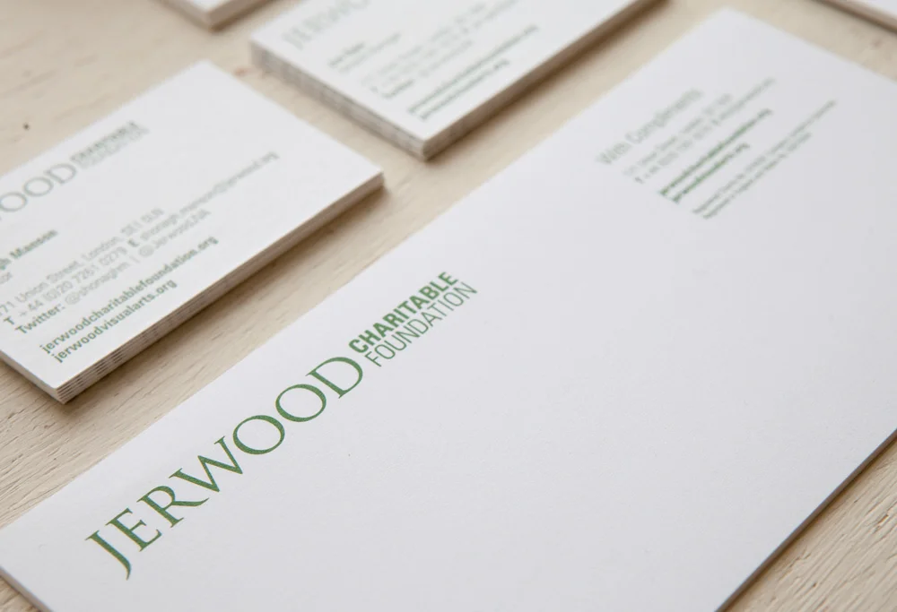
This new logotype was created for the Jerwood Charitable Foundation in order to help distinguish their prestigious work within the creative community. Applied across a range of hand letter-pressed stationery this marque provided a solid, contemporary development that remained true to the Jerwood brand heritage as a whole. Combined with original illustrations a set of limited edition postcards letter-pressed on 540g Bright White Colorplan and partner-centric brand guidelines were produced to help launch the new brand.

●  Created with Teacake  ● 

cc_1.jpg
cc_2.jpg
cc_5.jpg
cc_6.jpg
cc_3.jpg
cc_4.jpg

Charles Campbell Bespoke

July 28, 2013 by Graham Sykes

Every man needs a tailor and every bespoke tailor needs a bespoke identity to promote their traditional craft to a modern and sophisticated audience. It was Teacake's job to do just that and with the help of Ilyanna Kerr we created this logo using a traditional serif typeface and line drawing of a master tailor’s most important tool. To date I have led the design of their website and been involved in producing shop signage, window graphics, advertising campaigns and a range of packaging including string handled carrier bags, shirt boxes and tie sleeves.

●  Created with Teacake  –  www.charlescampbellbespoke.co.uk  ●

Site_TripSnaps.jpg
Site_TripSnaps_2.jpg
Site_TripSnaps_3.jpg
Site_TripSnaps_4.jpg
Site_TripSnaps_5.jpg

China

July 28, 2013 by Graham Sykes

During the summer of 2012 I took time away from the UK to embark on a trip to one of the most fascinating countries there is. Taking in the sites, sounds and smells of Shanghai, Beijing, Suzhou and the Great Wall was a feast for the senses. The overpowering scale, diversity and sweltering humidity combined to provide an immersive insight into a fantastically intriguing nation... fried river eels were also a highlight. Just a few of the things that caught my eye feature above, a full album will be available online soon.

Deptford_X_1.jpg
Deptford_X_4.jpg
Deptford_X_3.jpg
Deptford_X_2.jpg

Deptford X

July 28, 2013 by Graham Sykes

Deptford X is a contemporary arts festival exhibiting some of the most exciting work from across the UK and beyond. After ten years of success I worked with a team to re-brand the event and create a new website that would help visitors plot the trail through the art work on display and give event organisers complete control of their webspace to help guarantee the events future in the art world's calendar.

●  Created with Cherry  –  www.deptfordx.org  ●


day_1.jpg
day_2.jpg
day_3.jpg

Day + Night

July 28, 2013 by Graham Sykes

Another self-initiated project, this A2 posterised wall planner was painstakingly art-worked to show the hours of daylight throughout 2012. Printed in metallic silver on Purple Colorplan the 'Day + Night' project was distributed to our friends, collaborators and clients ready for the start of the new year.

●  Created with Cherry  ●

BLD.jpg

Behind London Doors

July 28, 2013 by Graham Sykes

This typographic identity was created for a revolutionary new online shopping tool. Still in its development and testing phase we have been working closely with the company's expansive team developing a range of digital prototypes and positioning a brand that aims to bring the convenience of the high street to an ever growing on-line audience.

●  Created with Teacake  ●

View fullsize AOP_1.jpg
View fullsize AOP_2.jpg
View fullsize AOP_5.jpg
View fullsize AOP_3.jpg
View fullsize AOP_4.jpg

AOP Digital Summit 2011

July 28, 2013 by Graham Sykes

Following on from the success of Cherry's branding for the previous year's AOP Digital Summit I worked on rejuvenating the brand for the proceeding years event. Exploding the original QR code inspired theme I introduced a new colour palette and rolled out the design across all aspects of the event with significant impact. This covered both off-line and on-line promotional material and large format event graphics for the day itself.

●  Created with Cherry  ●


FILMMAKERS ELVES

July 28, 2013 by Graham Sykes

Working with an acclaimed film and tv producer, Teacake were given this treat of a title to create an identity for a new film production company in London. To maintain a sense of creativity we worked with a playful symbol and clean, crisp typography. The aim was to create a crest with an established aesthetic, that would offer weight and gravitas with a smile.

●  Created with Teacake  ●

Site_TripSnaps_Reykjavic.jpg
Site_TripSnaps_Reykjavic_2.jpg
Site_TripSnaps_Reykjavic_3.jpg
Site_TripSnaps_Reykjavic_4.jpg

Reykjavic

July 28, 2013 by Graham Sykes

Rykjavic is the world's most northerly capital and provides an abundance of sights both natural and man-made. On a recent trip I was lucky enough to visit Gullfoss Falls, the Strokkur Geysers and natural hot springs... as many a visitor does. Well worth a visit. Good food, stunning landscape, crazy night life – Judith Chalmers eat your heart out!

← Newer Older →